Dashboards
Compose grids of widgets for quick actions, device toggles, sensors and favorite automations.
On this page
Dashboards are customizable widget grids, designed for touch. Open them from the top bar → Dashboards. On a fresh install, Walldash creates a default Home dashboard with a 5-day weather forecast, so there is always something useful on screen; rename, extend or delete it like any other dashboard.
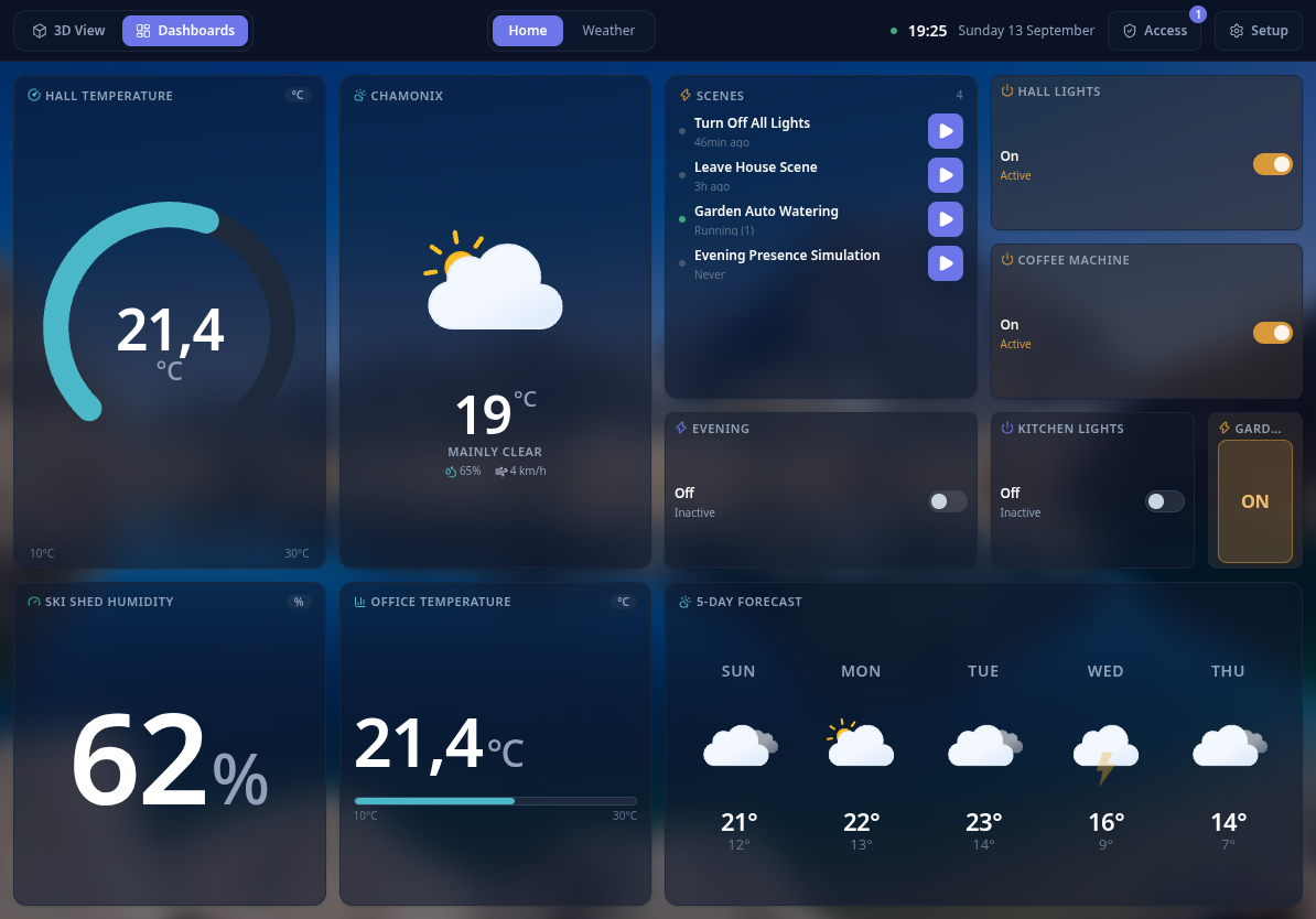
On a phone
On a phone (viewport narrower than 640 px) the dashboard drops the fixed grid and becomes a single vertical scroll of widgets in at most two columns. Single-cell widgets take half the width, wider widgets span the full width, and the order follows the layout you composed on the tablet. Taps still trigger the widget’s action; layout editing stays available on a tablet or desktop.
Widgets
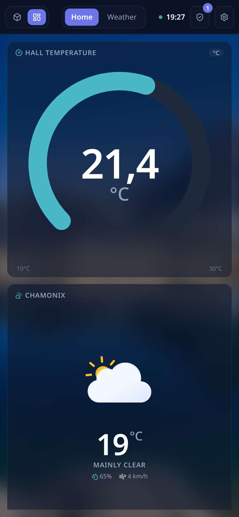
A widget is a single block anchored in the dashboard grid. It is bound to one or more devices or automations, and rendered according to a display mode:
- Number — a large numeric reading.
- Arc — a downward-opening dial between two bounds (great for temperature).
- Bar — a horizontal progress-style reading.
- Toggle — a tap-to-toggle device.
- Switch — a two-position automation switch: one automation runs when you turn it on, another when you turn it off.
- List — a list of automations with their last run time.
Because the display mode is independent of the data, you can show the same sensor as a number, an arc or a bar.
Automation switches
An Automation switch is the quickest way to expose a pair of frequently used automations as a single control. Configure one automation for the On position and one for the Off position:
- turn the switch on → Walldash triggers the On automation;
- turn the switch off → Walldash triggers the Off automation.
The switch position reflects the most recently triggered of the two automations, so it stays in sync even when an automation is started from Home Assistant rather than from Walldash. On a 1×1 tile the switch fills the cell with a single ON or OFF button; wider tiles show the state text next to a toggle track. Tapping anywhere runs the automation for the other state.
Viewing vs editing
The dashboard view is display-only. A tap on a widget only triggers its primary action: toggling the device for an actuator, or nothing at all for a sensor.
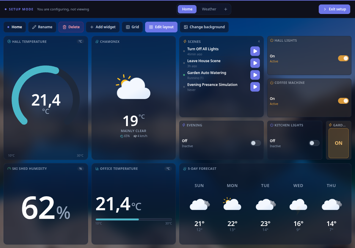
Composition happens in Setup → Dashboards. The Setup button on the dashboard view opens the editor for the dashboard you are currently viewing:
- Edit layout or Add widget to compose the dashboard, then drag widgets to rearrange the grid. The grid fills exactly the screen, so layouts stay consistent across tablets.
- Grid to change this dashboard’s grid size (columns × rows). The size is stored per dashboard, so each dashboard keeps its own configuration; a size that would push a widget outside the grid is refused.
- Change background to pick a picture for this dashboard — every dashboard has its own background.
- Rename or Delete the current dashboard, or use + in the Setup banner to create another one.
While editing, the Setup banner also shows the dashboard switcher so you can jump from one dashboard to another.
Stale values
A measurement is marked stale when its entity is unreachable or has not been refreshed for more than thirty minutes. Stale widgets stay visible but are visually de-emphasized so you never trust an out-of-date reading.